The best, the worst, the in-between
The colours of the Nissan S30s (240/60/80Z)
My first aricle will, of course, cover my most and least favourite specs for my dream car, the Nissan 240Z. Technically the Z432 but, hah, yeah, as if I’d ever get my non-US-American, not to mention non-Japanese hands on one of them. Have you seen the prices for them!?
In any case, I’ve always had a strong draw to the Fairlady/Z-myth. The Nissan 350Z was, for the longest time, my favourite car alongside the Dodge Viper SRT/10, The Ferrari F360 and, due to sentimental reasons, the Renault Twingo Gen 1. And yes, I loved the Twingo before every Insta/TikTok-Bro bought them, clapped them out and ruined the market for the rest of us true enthusiasts. Screw these guys with a rusty, erm, screw driver.
BUT back to the Z. I’ve always loved the long hoods (except on the 300Z), sharp lines and often angular design that still somehow flowed marvelously. Then the unique sound of the inline-6s and later V-6s… just the entire package, you know? The older I got the more I started leaning towards classic cars and, befitting my history major, I started to appreciate the roots where a car comes from a lot. And that’s when I started to fall in love with the Nissan 240Z. Some people may call it an E-Type from Wish, but for me it’s a hot podge of classic greatness, of an E-Type mixed with a Ferrari 275 GTB and even a bit of Porsche in there if you take a look at how the rear drops down. It’s gorgeous and I YEARN to have one.
Well, realistically, I yearn to have any of the S30s. The 240, 260 and 280 are different cars, yes, but their overall design is similar enough that, from a pure design standpoint, I'd argue that it doesn't make much of a difference to me. Sure, the bumpers get bigger and the car bulkier and more GT and cruiser than sports car in later years, but the overall design is very similar. It needs to be said, though, that the S30s 2+2s look kinda… weird. So I’m mostly talking about the 2-seaters here. ALSO, as the S30 is exceedingly rare where I live – I haven’t seen a single one in Austria live yet – I’m building my information based on photos from American and Canadian models. I obviously also can't say anything about their ride comfort or performance other than how they behave in various racing games. So yeah. Let's go on a colour deep dive. Before someone comes at me with pitchforks after this article, let it be known that I think most colors can look good on most cars, my articles are generally less a definitive “Holy f….udge this SUCKS” and more like a “in my opinion, this is the weakest/least fitting/whatever option”.
The 240Z (1969-1973)
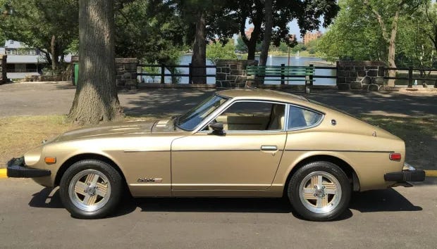
With that out of the way… Had I unlimited money, my absolute preference would be a 240Z 2-Seater in orange, paint code 918, to be precise, combined with a matte black hood and black RS Watanabe wheels. Note: depending on your source, the paint code 918 might also sometimes be called New Sight Orange. This is not to be confused with the NSO-color that Nissan launched recently. Same same but different. All clear? Good.
Anyway, this particular hue of Orange is such a brutally self-confident, flashy and loud but also elegant color that plays tremendously with the 240Z’s lines. In sunlight it looks absolutely fiery and makes the car look fast and agile even at a complete standstill, while in shadows and overcast conditions, the car turns a lot redder and richer – I mean, d’uh, but I don’t really know how to phrase it otherwise. In the shadow it kinda reminds me of a bit of fresh lava, if that makes sense. Black was the only constantly available and honestly preferred interior option here. The bright colour needs hard, strong contrasts, and black offers that. That orange and black are the dominant colours the 240Z rally cars had back in the day is also just nice. And yes, I know the oranges aren’t the same on the images, but seemingly the formula and light conditions matter a lot for 918 orange. There’s something magnetic to me about this particular color, it was the first car that made me realize I LOVE orange on sports cars and it’s been cascading ever since. I mean I knew orange looked good before - it’s a banger on muscle cars and Porsche 911s - but the 240Z was the first car I felt like got transformed by this hue… if that makes any sense?


It also looks spectacularly good in 113 Green Metallic (aka Leaf Green or Avocado). Whilst the flat orange reinforces the power and performance of the 240Z, the green – especially in combination with a lush brown interior – brings focus to the comfortable ride and grand touring capabilities of the Z. Which the car had, from what I heard. In the shadow it’s subtle and unassuming whilst in direct sunlight it’s as vibrant and attention-grabbing as the orange. Over brown, Green Metallic also offers a different take on the legendary dark green / tan combination. If you look at the picture below, when direct sunlight hits the hip line of the car in Green Metallic it’s just one of those “hell yeah” moments.
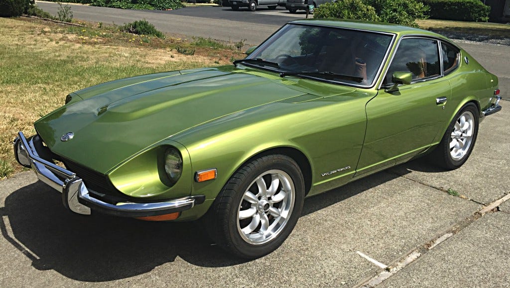

Brighter, metallic greens are in general a pretty underrated color for classic sports cars in my opinion, and this is absolutely no exception.
But it’s not all sunshine and rainbows, dearest gentle reader, because even the prettiest car isn't safe from a meh color or two every now and then, and for the 240Z my pick would - ironically with how I started the sentence - be 919, Sunshine Yellow. My issue is that while I do actually really like yellow cars as it turns out, they have to commit. They have to be balls-to-the-wall, bright and flashy. If your car is yellow, you pull attention to it no matter what you do, so have the confidence to own it. If you go with a pale yellow, you don’t own it. I know, in the 60s and 70s pale and pastel colors were all the rage, but speaking as someone who drives a messed-up old, bright red Renault Clio, self-confidence is important. If pale yellow is something you like, all the power to you, but for me it’s hands down the worst pick. It tries to be flashy and agile but it comes across as faded and non-commited for the sports car aspect of the Z. It’s got too little pop for a proper sports car color.

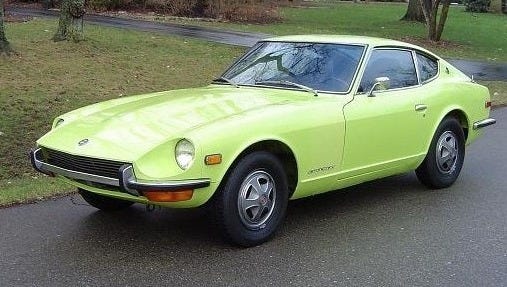
That being said, and maybe you’d put this on number one, there is another color that comes dangerously close to having the dubious honor of being named „the worst official color for a car as decided by a nobody on the internet“, and that’d be 112, Yellow…. Which in reality is lime green? Make no mistake, I like lime green a lot on many sports cars, but only if it’s a metallic. Here, as a flat color, it looks… plasticy, cheap and as if a 2020 broccoli-haired takeover-kid wrapped their base spec Challenger in neon green for attention. It dulls the elegance of the 240Z and just looks… tacky.

The 260Z (1974-1978)
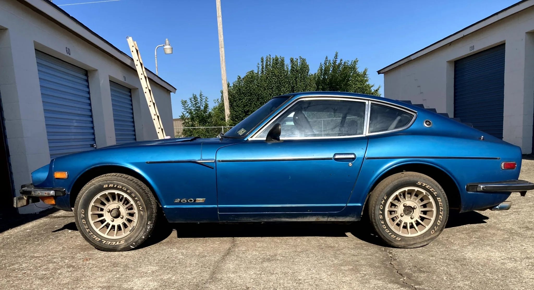
Let’s now switch to the middle S30 child. The 240Z got heavier and, to compensate for the increased weight, the previous 2.4L inline was upped to 2.6L and got a bump in power. It’s almost like the engine displacement gave the cars their names. Huh. Besides that though, the car stayed essentially the same, but we got new color options! Right away, for the 260Z, I really really like Pacific Blue (aka Blue Metallic), code 307. It’s heavy enough to stand up against the dominant bumpers on its own but isn’t as oppressive or as dull as the 1978-one-year Black Pearl (638) or Cocoa Brown (214). 307 is essentially a pure, medium-dark blue that’d look fantastic on any grand tourer, especially playing against the long hood and the short cabin of the S30. It could be had with a beige interior and medium or dark blues over beige are always a winning combo. In the sun it sparkles like the ocean it was named for, and when the light hits the right angle and highlights the upper part of the door like in the image below it’s a marvelous sight and interplay of blue hues. In the shade it’s, predictably, more subdued and cold while still giving the 260’s shape itself more presence; on other words, in direct light the color highlights the curves and various panels while in the shade it works well with the shape of the car itself, helping to sculpt it.

My second „good“ pick would, for much of the same reasons, be 303 Emerald Green over Brown for the ultimate call-back to the classic European sports cars that inspired the S30 in the first place. Emerald Green is a very sparkly, well, green with strong blue undertones in direct sunlight that gives the car a lot of depth and drama if the sunlight hits without making it ostentatious. Emerald Green also works really well on the 2+2 model though as the longer wheelbase gets visually gobbled up by the green.
 | Bring a Trailer")

Now, the flipside! I gotta admit, the 260Z is in a sweet spot. It has the beauty of the 240Z without the colors that these days we’d often see as just outrageous. Pretty much everything looks good on it, so my pick would be something just boring for it – and that’d be 904 White (over Black, only option) and 901 Silver Metallic (aka Light Gray Poly). Neither of these colors are bad - but they’re bland; which is almost worse.
Speaking of bland - declaring silver the worst or blandest color of a car if brown exists is a bit of a controversial take I feel like, but I don’t really like silver on most cars. Maybe it’s the saturation of resale silver, grey and black these days everywhere, but I just don’t understand the connex between these three colors and “sporty”. Some modern silvers like Porsche’s Rhodium or Liquid Metal Chrome Blue really let you know that something’s up, but that’s the thing - they have strong hues of blue. 901 just doesn’t. Silver 306 looks much better cause it’s like a crisper white-silver instead of grey silver and that makes all the difference. In certain lights - such as seen below - 901 Silver Metallic looks like primer for crying out loud! It’s so BORING. Note - the model below has 240Z bumpers, probably retrofitted.
 | Bring a Trailer")

Now white CAN look spectacular on sports cars - Porsche’s Carrara White, Ferrari’s Bianco Avus, Ford’s Wimbledon White - and it does look good on the 240Z thanks to the smaller bumpers, but on the 260Z with the Habsburg-chin and Kardashian-butt, it makes the car look even longer. Plus it’s just milquetoast here, isn’t it? The 260Z has beautiful lines, but it doesn’t have enough dimples, vents, edges and whatnot to make the white not look, well, empty. Granted, from a ¾ rear view, white does look good, but from the front or the profile… eh. White is playing it very safe is what I’m saying. That it’s a flat white instead of a metallic where you could add some interest with metal flakes doesn’t really help 904’s case.


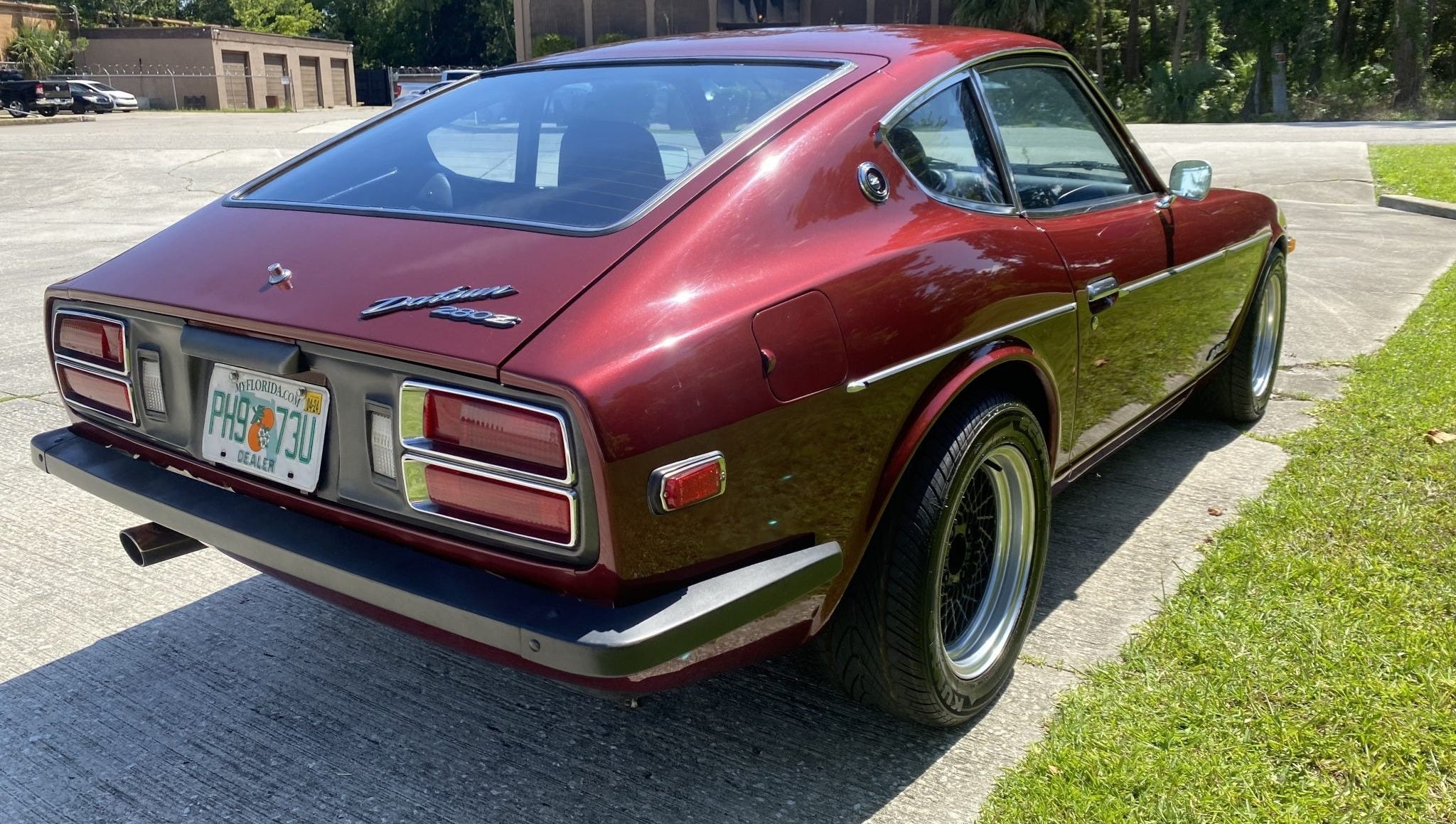
The 280Z (1975-1978)
Yeah the youngest of the S30 trio was built at the same time as its predecessor. The 280Z differs from the 260Z in that it’s gotten even softer, become even more of a Grand Tourer rather than a sports car and distinctly started leaning heavily into comfort rather than performance. The 280Z shares a lot of colors with its older sister, which makes sense considering they were built at the same time. However, it also had a few colors that really popped out and brought back the 60s madness of the 240Z, and I’m gonna start with my worst pick this time around cause boy we gotta talk about it – I present you 517 Beige Metallic. Feast your eyes. while I’m genereally tired of forced brown car hate, by the gods am I ever guilty of hating beige cars, ESPECIALLY beige sports cars. Beige is the colour you pick on your messed up European coldhatch econo-shitbox or your beaten-up 7-seater minivan. And that’s doubly so on a grand tourer that still has sports car lines. The look is even worse on the 2+2 models as the stretched wheelbase appears even MORE stretched thanks to the light color. Couple this with a beige or brown interior and you got a spec that absolutely makes you know what decade the car is from, and not in a good way. You see a beige, somewhat-to-very angular and pointy car and you immediately think of the late 70s and 80s. A good color is dateless - Silver, red, certain shades of yellow, blue, black - but beige looks very dated very quickly. GOD I hate it.

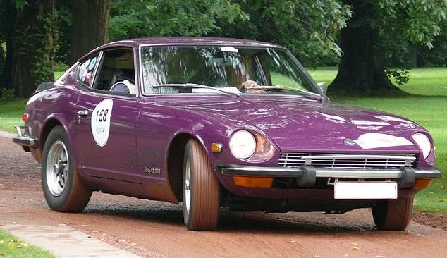
My runner up would be 362 Dark Purple as while I’m always glad to see strong colors on sporty (looking) cars, this isn’t it.There’s something about this particular hue of purple – and purple is my favourite color – that just looks cheap and tacky. if you were to throw in yellow accents like vintage Cibié headlights, you’d get a motherducking Wario-Mobile. That being said, the gap between this and Beige Metallic as “the worst color for the 280Z” is pretty big. According to my source the 280Z (and, seemingly also the 260Z?) only came with a black interior if you went for Dark Purple, which was honestly a good call. The colour would look even more cartoonish than it already does if it had been available with a beige or tan interior. The purple we see below - and it was the only image I could really find on Google, believe it or not - sits somewhere between fuchsia, purple and violet and takes the worst from all three worlds. It doesn’t have the richness of real purple nor does it have the warmth of fuchsia or the depth of violet. Or, to put it simply, it just isn’t for me.
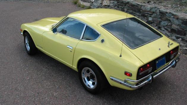
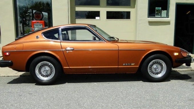
Now for the best picks for the 280Z. They’re simple - 611 Wine Red (aka Sparkling Burgundy Poly) and 301 Light Brown Metallic. Yes, brown. I mean, is it really brown or more just a really rich copper? Over the years, copper, bronze and even some warmer, darker golds have really grown on me, and I blame this color that. There’s genuine warmth and elegance in a sparkling copper grand tourer with a long hood and short cabin. And if the color shifts dramatically between bright orange-ish highlights and brown shadows as is beautifully illustrated on the image below with the top and shoulder line in highlights and the rich, full brown on the side skirts, t’s a real winner. Just don’t get yours - I know you want one too, now - with a beige interior. This copper-brown is kind of the self-confident brother of my reviled beige I couldn’t stop complaining about above; both beige and copper fall into the brown spectrum of cars, but here the brown is a color with purpose, with a sense of self-confidence. It highlights the classic shape and even plays with the objectively ugly-as-sin bumpers to create a long, flowing eye-catcher.
 | Bring a Trailer")
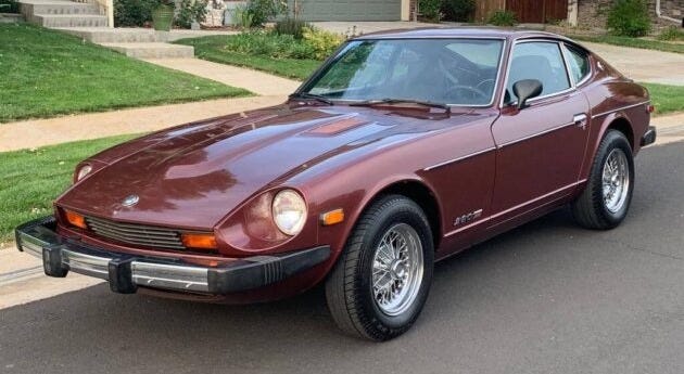
But the winner-winner for the last of the S30 Fairladies - in my opinion- is 611 Sparkling Burgundy, is a subtle, elegant winered that matches the still-glorious shapes of the 280Z very well. Yes the protruding bumpers disturb it, but it’s not as bad as it might be with a brighter or more saturated red; much like with the copper above, 611 plays well with the bumpers instead of fight it, and the shift in hue between the more pinkish highlight color and the red-violet shadow color distract from the shapelessness the bumpers threaten to bring to the balance of the car.
And yeah… that’s all I have to say for now. If you agree or disagree with me, let me know in the comments, subscribe to my newsletter and I thank you for reading this very first article here. It was a lot of fun - and a lot of work actually - to write, so I hope you had some fun reading it as well. If you want to do your own digging in the meantime, I’d point you towards https://www.zcarguide.com, https://zhome.com and the usual auction house listings – Bring a Trailer in particular has excellent photo documentation.